Design | July 31, 2019
Five Helpful Roller Banner Design Tips

How to Design Effective Roller Banners
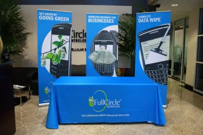
Looking for effective and eye-catching roller banners in Colorado? Our expert sign designers have put together a list of helpful design tips so you can achieve all your goals.
Add Contact Details
Contact details will give readers information on how to best contact you to get more information about your services or find out more about your unique products. Include your contact number, email address, and website. Don’t forget to include your social media addresses.
Include High-Quality Images
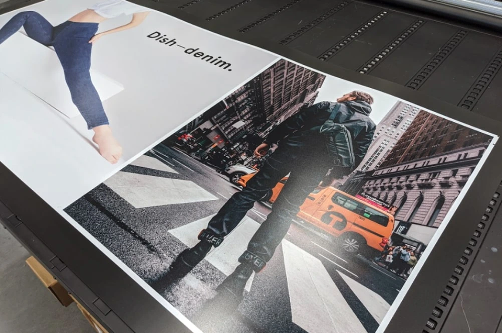
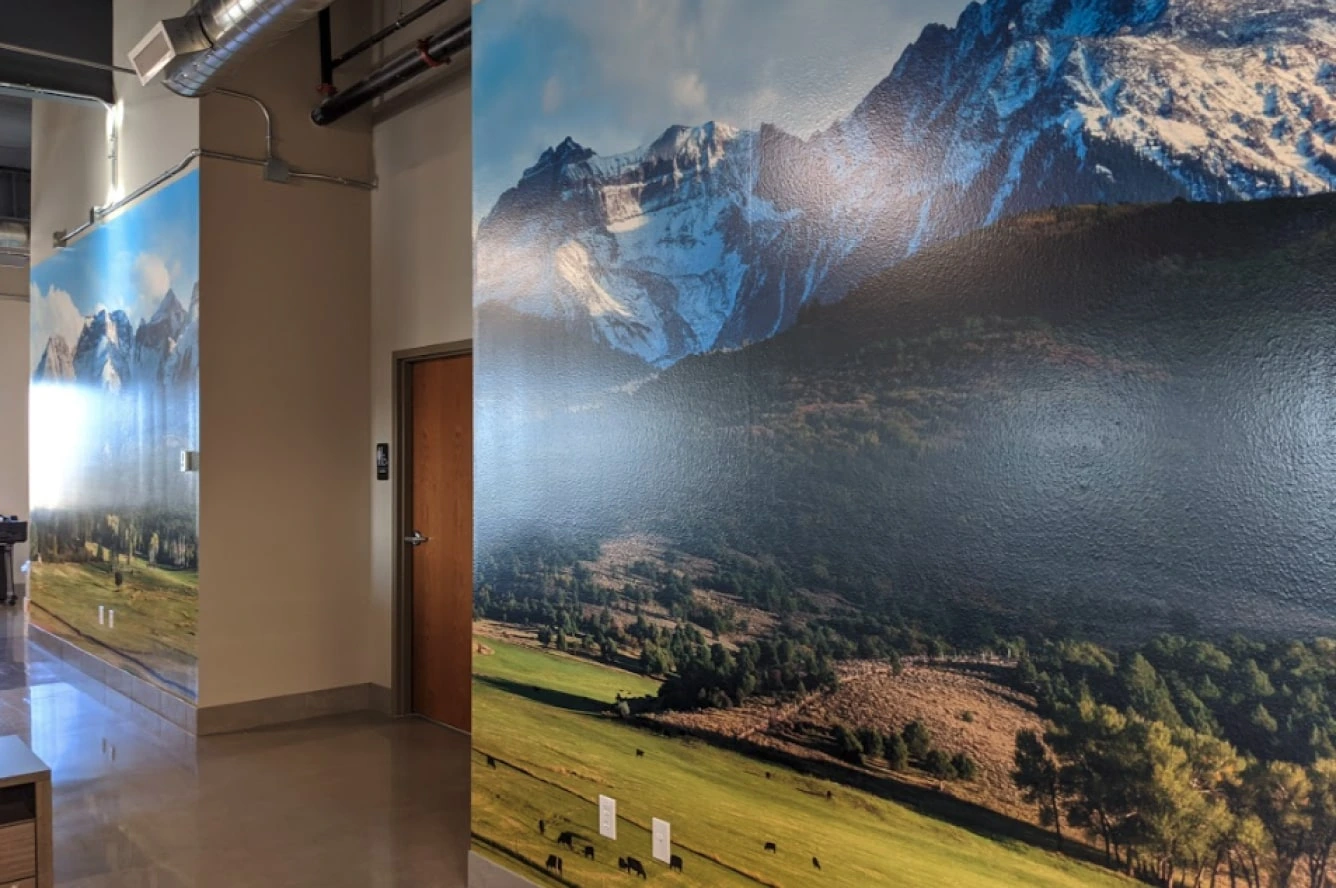
High-quality images start at 300 dpi and save as CMYK ready for print. Stay away from poor quality taken directly from the internet and saved as RGB.
Place Your Logo at the Top
Your logo and central message are one of the most critical elements of your roller banner. Make sure to place it at the top where it has higher chances to grab possible customer’s interest as they pass by it.
Avoid Stuffing the Banner
Avoid stuffing the banner with irrelevant information and keep words to a minimum. Additional information can be used for creating flyers, strut cards, brochures, and any other advertising material.
Use Colors Wisely
Colors play a key role in the success of your banner. They must complement and work hand-in-hand with your existing corporate colors, and of course, your social media, website, and logo. When selecting the color for the banner's background, keep in mind two things. First, bright colors like orange and red can catch peoples attention. But be sure to avoid using white and yellow together, as it will make it hard for readers to understand the message from a distance.
A roller banner can help your products or services stand out at your next exhibition, but it is vital that you get the design basics right. Mammoth Graphics experts will guide throughout the designing process and will print out quality roller banners for your next exhibition. Call us at (720) 348-2690 today!
